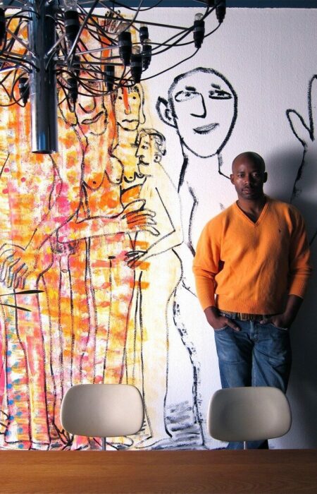
House Industries is a dynamic typography house whose fonts make graphic designers the world over look cool. Headed by founders Rich Roat and Andy Cruz, the ragtag staff at House Industries consider themselves blue collar designers and love that their work reaches everyday people through posters, signs, cereal boxes or greeting cards ‘wishing happy whatever.’ They initially work out font design concepts by hand, just as they did as kids doodling rock band logos, and only then translate that design to the digital world through sophisticated high-tech tools. In an age of fast-paced mediocrity, Rich, Andy and the crew stand out as hungry students of pop culture and brilliant artists unrelenting in their devotion to detail.
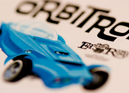
Rat Fink font family merchandising, House Industries
You started working together in 1993 and officially formed House Industries as a font foundry in 1994, and, according to your hilarious timeline, started experiencing viral success about 10 years later. Were there any moments of doubt or come-to-Jesus discussions during that uphill climb?
We have doubt and come-to-Jesus discussions once a week it seems. Sticking to a set of aesthetic principles and working on a project until it’s finished instead of applying some sort of arbitrary deadline is a great way to maintain integrity but not always a great way to run a business. Business isn’t any easier now. Problems pop up every day at a magnitude that is directly related to the size of the operation and the baggage we carry along with us.
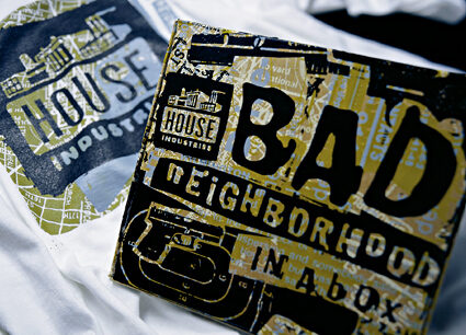
Bad Neighborhood font family merchandising, House Industries
Your fans around the world point to your serious craftsmanship and your willingness to begin work on a font family by hand as what really puts House Industries in a different league. What does working out font concepts by hand gain you, and how are you transitioning to digital work further in the process?
We never mean for our process to be a gimmick or something that sets us apart. That’s just how we like to work. We’re not luddites. We use the technology that’s available to us today to our advantage. We would never be able to implement the features in Ed Interlock or the Studio Lettering scripts without digging deep into the latest OpenType specification provided by Adobe. At the same time, there really aren’t any utilities that come even close to capturing the soul of the ink that flows from Chris’s and Adam’s brushes, Ken’s pencils, Andy’s sketchpad, Ben’s bezier tool or Bondé’s x-acto knife. The point being that pens, brushes and pencils no more make an artist than an expensive computer or modern piece of software. The magic is in the execution, not the tool.
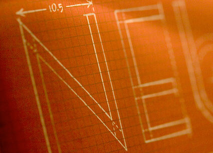
Developing Neutraface font family, House Industries
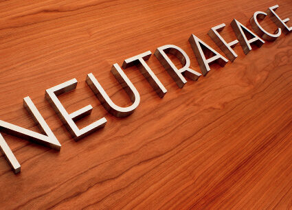
One of the Neutraface fonts, House Industries
You talk about House artists mastering a large cross-section of design disciplines — melding cultural, musical, and graphic elements. Describe how the whole process of designing a new font family starts and what sorts of discussions or tinkering happens along the way. Are you playing music as you work? And do you ever have to duke it out with each other over certain design aspects?
A concept starts with a genre that interests us. Then we start digging and hit these irresistible veins of cultural ore that we feel obliged to pursue so we can faithfully tell the whole story typographically and illustratively. After the digging is done, I honestly don’t know what everyone is listening to because the headphones go on and the heavy lifting starts. Somewhere at the bottom of those veins of ore is hell, and the devil in the details lives there. And yeah, when it reaches that pitch, we fight like a family.
Your heroes in design and typography have been found in Mad magazine, hot rod and skateboard culture, video games, and the hardcore music scene — those who created what you refer to as honest commercial art accessible to everyday people. Do you find it ironic and gratifying that you’ve come full circle and find your work incorporated into honest commercial art that is accessible to everyday people?
We all have become somewhat immune to it. Seeing the type and the influence pop up out there in the real world is a byproduct of the marginal success that keeps the company afloat. We’re glad, grateful, honored and sometimes weirded out that we’ve had the impact.
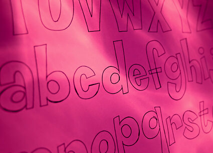
Developing Coop font family, House Industries
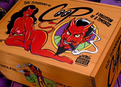
Coop font family merchandising, House Industries
You tell a story about your trip to Las Vegas, expecting to see a city rich in typographical icons, but you were disappointed about what had been lost. Tell me about your work to unearth those iconic designs and reinterpret them for today.
Wow! We did that ten years ago. If we did it now, we would have dug so much deeper. I’m glad we did it in 1999…knowing then what we know now would have been an incredible burden. We went to Las Vegas with the romantic vision that the city would do something to preserve some of those icons of commercial art. But to the people who really own them, they were just a draw to bring wallets inside and put money down on the tables. In the end, we just saw it as the heyday of the journeyman commercial artist. The Castaways logo was a fantastic piece of lettering, so we gathered every piece of reference we could find to draw a reasonable typographic homage. At the same time, we took a piece of classic artisanship and made it practical in a modern environment. Maybe we did the same thing as the people who built the Venetian, just on a much smaller and more reverent scale.
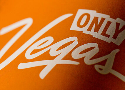
The Only Vegas logo House Industries did in 1999, which influenced their Las Vegas fonts
In developing the Ed Benguiat font family, you talk about breaking down this typographer’s Photo-Lettering alphabets to pencil sketches before pushing the limits of typographic technology. Tell me about this process and what sorts of technical limits you’re pushing.
That was an interesting case study because we started with a blessing from Ed, then used the small “one-liner” specimens from the Photo-Lettering books as a basis for the new fonts. Somewhere in the middle of it, we purchased the actual Photo-Lettering collection of films. This gave us first-hand reference to the entire alphabets of the fonts we were drawing, but also increased our burden as type designers.
When an art director would order a headline for Photo-Lettering, they would select an alphabet, sketch the layout and send it over to PLINC [Photo-Lettering, Inc.] Then the art director had the advantage of an experienced typographer or lettering artist who was sweating the details before they made that beautiful heavy white velox that was couriered back to the art director’s studio.
Our challenge was to revive that expertise, but in digital type. Some of the nuances were as easy as writing simple substitution routines, drawing alternate characters or Ken doing his little magical bouncing baseline tricks (Ed Roman). But Ed Interlock presented a unique challenge that wasn’t as simple as drawing lots of locking ligatures. Ken and Tal Leming got together to devise a complex multi-layered substitution script that looks backwards and forwards in a line of text to make lettering decisions. This was and still is one of the most elegant applications of OpenType features in a commercial typeface. And it was all done in the interest of mimicking the decisions that the Photo-Lettering artist would have made.
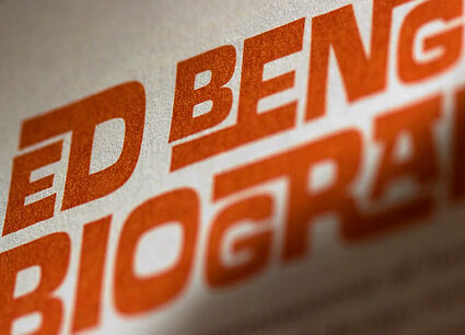
Ed Interlock from the Ed Benguiat font family by House Industries
I’m fascinated by the description of what went into your Studio Lettering font family. Are you guys on the forefront of this computer programming that allows a letterer’s habits to be synthesized into systematic routines?
We took everything we learned with Ed Interlock to the next level. Ken had the hot hand and Tal Leming knew how to fool an OpenType font into thinking it is a lettering artist. There are other type companies out there trying to use the technology in a similar application, but none doing it as elegantly or beautifully as we are.
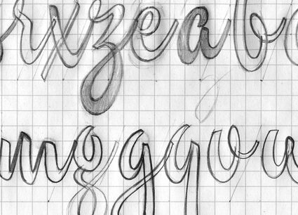
Hand drawing Studio Lettering concepts, House Industries
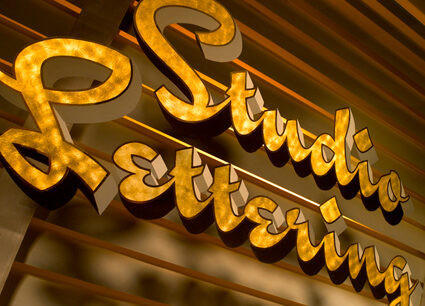
Studio Slant from Studio Lettering font family, House Industries
And you’ve developed colloquial character sets that allow for cultural nuances and international appeal. What font families have you done this work for, and what kind of response have you gotten from the international design community for putting in this effort?
Studio Lettering is the only set in which we have fully implemented the colloquial character sets. If I was writing my MBA thesis, I would not put this down as a way to make money with typography. But this is one of those crossroads of art and commerce where art has the right of way. In all seriousness, we probably have not tried to market this concept effectively in other countries. It’s a hard concept to grasp if English is your first language.
You’ve gone beyond typography and even illustrations to developing objects such as furniture, textiles, sculptural elements and, in the case of the Girard family, dolls, puzzles and more. How did you start down this path, and do you feel these objects are a natural creative extension of the font families they’re associated with?
All of those objects started as expensive photo props for our catalogs. We figured that if we had to make one, why don’t we try to see if we can “mass” produce them. Also, digital type is really electronic vapor. We love to leave our customers with a tangible reminder that we actually exist.
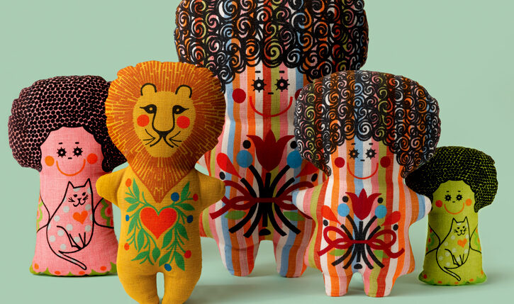
Marilyn Neuhart dolls, by House Industries as extension of Girard font family
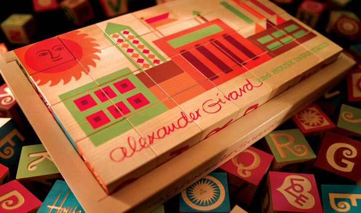
Girard Blocks, extension of Girard font family, House Industries
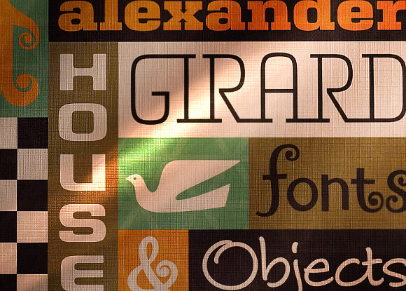
Collage of Girard font family, House Industries
One thing you’re most known for is partnering with some of your design heroes and using their original work as a launching pad. What kind of pressure do you feel to honor their aesthetic, and can you tell me how this process begins?
Most designers take the back door and try to hide their influences in their secret swipe file. Entire modern identity systems of major corporations have been deftly cribbed from a hidden stash of 60s-era design annuals. We’re just taking that monster who lives in every designer’s basement to the dining room table to meet the rest of the party.
Is there a pressure to honor their aesthetic? No. Because when the effort is out in the open, there’s nothing to hide. The process begins by picking up the phone. Ed Roth wasn’t on Facebook in 1995.
You talk about spending countless hours as kids perfecting the interlocking letter forms of Judas Priest and Iron Maiden logos on your notebooks and jean jackets. What do you think it is that helped you take it beyond this doodling that so many kids do and become artists as influential and loved as you are today?
Somewhere along the way, all of us became enamored not only with the logo, but with the guy who drew the logo. I think if you take that obsession to the next level, forget the shortcuts and make sure your soul shows in the work, people will recognize and appreciate it.
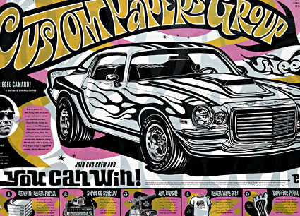
Custom Papers Group project, House Industries
With all of your success, you’ve kept your blue-collar sense of yourselves, and certainly your sense of humor. Where do you see your work going from here?
Good design is blue-collar. We’ll be working this hard until we decide to hang it up and find other careers or get too old to deal with the agro. Where are we going? Probably away from collaborations and toward more projects like Studio Lettering.
For young folks who feel a strong creative urge but don’t understand the world of typography, what would you say to them about this art form?
Learn the basics. Study the masters. Know the rules. Then your heart will tell you when to break them.
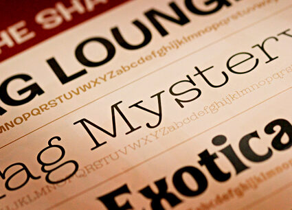
Shag font family, House Industries
What are some of the things that make for a great environment and productive studio in your day to day work?
That used to be an easy question until the team got bigger. We all have diverse interests, but for eight hours a day, five days a week, those interests converge on a common goal. I don’t know if we’re very productive in the modern sense of the word, or if we even have a great work environment. We all work really hard in a business that’s uncertain, especially in the face of today’s economic climate. I can’t say that everyone at House goes home happy every day, but I’ll go out on a limb and say that we can all look ourselves in the mirror and be proud of everything we have released over the years.
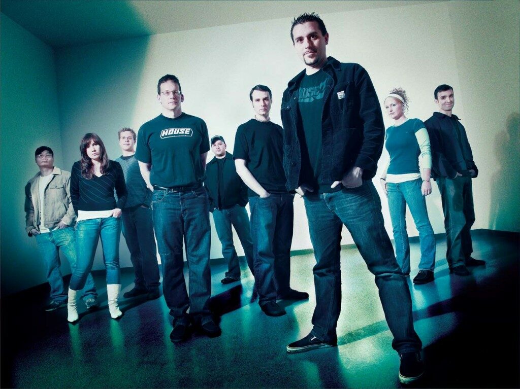
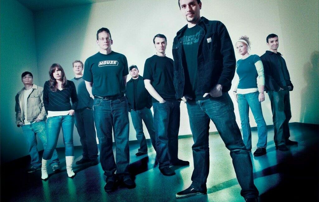
House Industries designers
